Thursday 3 May 2012

Portfolio layout


The content page took quite a long time to get how I wanted it because of the images I wanted to use. I tried moving them around with text to find what worked the best. 
I decided not to have page numbers to keep it simple I just had project section numbers. 

Here is my final content page layout: 


I put a brief description of what would be in the portfolio on the content just to give people a clear idea of what to expect before they look at my work. 


The website development pages was tricky to design layout wise. I didn't want to have page after page of screen shots, so I decided to do an interactive slide show so you could flick through the pages. However this could only be exported as an SWF file. So for my PDF version I used the same layout but only showed 2 main screen shots, and six smaller screen shots down the sides of the pages.


I realize lots of text is used throughout the portfolio, I just felt some projects needed to be explained to the viewer more then others to give a clear idea of what I did to develop it. This is why for each project title page I had a section of text explaining about the project. This doesn't look as creative as I would of liked, however after trying many different layouts I decided this was the best way to do it.


The main problem with this page was fitting all the text and images and title on one page, 
I tried different ways in which they would all fit together in order but settled for the simplicity - here is my final layout design for this page: 


I tried various colors for the texts and backgrounds but found that purple, yellow, white and grey was the color scheme that worked the best, and suited my work the most. 


I did like other color themes, however I still felt the one I settled on worked the best with my projects. 

Personal logo

Fashion Club Logo Process

Simple, cute design 


Looking at the use of color


The color violet is my favorite color, when I get the chance to use it in my work I'll jump at it, it has been used a lot in my portfolio. On the color wheel a nice lemon yellow works  nicely with the color violet - these are the colors which will be incorporated into my logo design. 


Simple grays and blacks work well with a splash of color. 


The right typography. 
 Images blending into works looks really good.


Looking at typography in logo designs 

The text can make a logo unique and personal to you, finding the right one that works well into your logo is important. 

Here are some logos with I liked the text of: 


 The colors in this logo are similar to the ones I would like to use in mine, I think
in this logo they work well together. 


Designing my own logo 


Logo design - Style 1 


For these designs I decided to use a flower, I really like the shapes in them and think they can be worked really well into any logo. I wanted something pretty and feminine. 
I experimented with typography and really liked the first one, the colours have turned out a lot brighter then when I originally saved it, however I am going to leave it like this because it makes the logo pop and stand out a bit more. 

I decided to use my initials (Samantha Jane Foster) because my full name looked to long and I think it works better because Samantha is such a common name.     


Logo design style 2


These were some logo designs I decided would work well personally for me. I decided to use the text I liked on my practise logos (see above) which was downloaded from dafont called 'girls are weird'. I used purples and yellows because they compliment each other.
I am going to use the shoe for my final logo, the shape is really strong - not to mention I'm a shoe person! 

Tuesday 1 May 2012

Portfolio covers


I liked this one visually, however there are lots of different things going on with this cover such as 'Fashion' 'Beauty' and 'Design' all look like main headings.


I liked the strong colors and lines of the image, and how the portfolio had a title 'Beauty will save the world' I thought this worked really well and it says a bit about the person behind the portfolio. 


Front cover


Back cover

It is important to remember a back cover when designing your front one, so they link in well. I like how simple this design looks, but when you take another look you can see the attention to detail and the effort that as gone into it. The colors stand out and work really well together. 


I liked the layout of this, but I'm not sure about all the clashing patterns and shapes. 


What I really liked about this was the use and design of her own logo. It made the whole thing more personal to the designer. 


Sunday 22 April 2012

Portfolio layouts


I like the strong use of images and the clear text in this portfolio it works really well visually. I like how a logo is used at the bottom of the page next to the page numbers, this makes it look more personal and professional. 


I like the simplicity of this layout, the plain background doesn't look boring because of the images and it looks easy to read and neat. It is very minimal but this works very well with the content in this layout. 


I really liked how color was used in this layout. The title page of each section had a color with then carried on as a theme throughout that section. Each project was clearly labeled and it was very easy to navigate through the portfolio. I also liked how images were used and also text but the text didn't over power the images, just backed them up with related information.   


Friday 20 April 2012

Improve your portfolio

I looked at this blog post called '10 winning ways to improve your portfolio' 


01. All killer, no filler

Resist the temptation to bulk out your portfolio with old or irrelevant examples of your work by having a thorough and ruthless clear out. And don’t leave this until it’s unavoidable. Portfolios need constant attention – you never know when you might be called on to present to Saatchi’s creative directors…

02. Number of your beast

How many examples should a portfolio include? It’s a tricky question, but you should aim to fill at least 20 pages of a physical folio, and at least 30 examples for an online space. You need to be able to show a healthy breadth of work together with a range of applications, so even if you select several examples from a single project you should make sure you treat image individually.

03. What’s your job?

Only include portfolio examples for a full-time position that are appropriate to the role. A creative director position, for instance, won’t entail much artworking - if any at all – so work that demonstrates tracking and kerning ability isn’t relevant.

04. All in the brief

Use annotations and notes to talk about your experience. Illustrators and designers aren’t just employed for their style but also for the clarity with which they interpret a creative brief. Make it clear what the brief asked for in each portfolio example you include, and then demonstrate how you successfully accomplished it.

05. All round experience

Are you only good at illustration or editorial layout? Of course you’re not: you’re also a solid communicator who understands budgets and deadlines, as well as the importance of meetings and updates. These are all professional skills. Make sure your portfolio clearly shows that you posses these, even inf you just list them in your accompanying notes.

06. Case studies

Don’t think of your portfolio simply as a collection of your art and design work. Recommendations and real-life case studies go a long way in showing how professionally capable you are. Ask a previous client or employer for a recommendation, and write up a short case study to accompany a project.

07. Numbers, guides and bookmarks

What do you do when you find a particularly interesting website, magazine spread or book chapter? You bookmark it, dog ear it or jot down the page number somewhere. Those viewing your portfolio – by whatever medium – will do the same, so make it easy by including page numbers and clear project titles for each portfolio example.

08. Getting to know you

Experienced employers, project managers and agents know how to match up a CV to a portfolio and gauge your character strengths and weaknesses, warts and all. So think critically about what your portfolio says about you. Is it too serious? Too flippant? Strike a balance that you believe shows off your qualities.

09. Tailor your examples

This is a debatable point, with some illustration agents advising against tailoring your portfolio to a particular project pitch or job application, and prospective employers concurring – but tailoring is advisable. The ‘no’ camp suggests they want to see your ‘whole character’ through different styles and projects. But if a subset of your work is wholly irrelevant, or even poor by comparison, do you really want to be judged by it? If in doubt leave it out.

10. Self-starter

Self-initiated projects are certainly acceptable in full-time applications, and recommended for freelance work – especially for illustrators. But think about what other talents you might have as well. For instance, if you’re a handy photographer or accomplished with coding, why not include examples of your shots or web designs. They’re all more strings to your creative bow.

I found this post really helpful:
- Only put in your best work
- Could have parts of other work such as photography
- what does it say about myself? 
- Add recommendations from other people about your work into your portfolio 
- Only have work which is relevant
- use annotation to explain a bit about the work 

Thursday 19 April 2012

Re-Working Projects

The first project I am going to re-work is the T-shirt design project for the brand RESPECT, when I presented my original project I got a few tips, this was to brighten up the yellow colour and to make the range of T-shirts more consistent.  


Looking at recent trends 


By looking at high street brands such as NEXT and GSTAR for inspiration I am able to pin point recent trends, the ones which kept popping up were screen printed graphics, numbers and grunge. 


WGSN TRENDS 

Skater boy

Stylised gothic elements inspire an edgier look for younger and older boys. Simple lines and typographic motifs are used in large scale on tees and jersey pieces. Use flock printing to bring motifs to life.
This relates well to the target market of both younger and older boys looking for an edger 'cooler' look. 
  

This could be used in the graphics of the T-Shirt to create this look. 


PRINTING 


Use shiny plastisol to exaggerate motifs.


Screen printing would also work well for the designs. 


Use flock printing to add a tactile feel to motifs.


Trend board 


Graphic board 


Re worked designs 


Re working styling project 


For this project I am going to produce advertisements for the make up brand BARRY M to get me started I am going to look at previous advertisements from the brand.


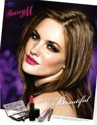
- The advertisements are close up face shots showing bright vivid make up which stands out in the image

- Some of the make up on the models have diamonds placed on there faces for extra emphasis, this works well in the images

- The logo isn't over powering and the backgrounds are generally quite plain and simple

- Differant phases are used on each image, either the name of the make up on the image or a simple catch phrase such as wake up your make-up


TV advertisements


In this video advertisement it show girl getting ready, a simple idea and when the girls were applying make up, text would pop up stating which make up it was. I think this is important to show the customer which product is being used, you could then also monitor sales on that product to see how will the advertisements as worked..i.e if the sales increase.


This video was quite short, showing zoomed in parts of the make-up with close up clips, on all the advertisements the models are young 'fun looking' girls, this is relating to the target market.


By looking through TV advertisements I have gotten a better idea about the target market the make up is aimed at. With the bright, quirky make up the brand is aimed at young girls who are not afraid to stand out. The brand is seen as a fun brand, all the adverts show girls laughing and excited.


Marketing week artical


Cult make-up brand Barry M aims to be as big as Rimmel and has launched a social networking site to harness the help of consumer power.

While other cosmetic companies are choosing celebrities to promote their wares, teen make-up brand Barry M wants its own customers to be advocates. Rimmel might have Kate Moss, but Barry M literally wants the girl next door

Competitors


LONDON - UK cosmetic company Barry M Cosmetics is launching its first TV campaign for its fashion make-up range.

Barry M
Barry M


The ads target women aged 16 to 24 and promote the brand's full range of brightly-coloured products, which includes lip liners, nail varnishes and eye shadow.
The national campaign was created by The Teds Agency and Gloss Media. TV ads show a ‘rock chick' carrying a guitar before the ‘screen comes alive with music and Barry M's 300 vibrant colours'.
The company said it decided to launch a TV campaign following three years of remarkable growth.
TV ads, which run for a month from 21 May, will be supported by press and on line activity. This will include the launch of a host of social media and web-based initiatives.
Barry M Cosmetics was created in 1982 by Barry Metro. The brand is now available in more than 800 Super drug and Boots outlets nationwide.

Promotion research 


I took a trip to Manchester looking at outdoor promotion. 


The best ones to use for the Berry M brand would either be an ad shell or billboard, these can be shown in the right places and will reach the primary customer and may also be seen by potential new customers.   


My Advertisement

- For my advertisement I am looking to sell Barry M as a brand, It is a high street brand which is affordable.

- Primary target audience for this brand is young girls and women
and the secondary target audience could be men and older women wanting to buy this product as a gift for their daughters.

- Persuasive techniques for my advertisement will be sex sells, if people think the product will make them better looking they will be more persuaded to buy it.

- Barry M is a brand that is about standing out and being unique, to put this across in my advert the image I will use will have fantastical elements to it such as diamonds and butterflies added in for extra effect.

- The advert will be quite feminine and aimed at the primary target audience, to make sure of this a young female model will be used for the imagery and the adverts will have bright colours which will stand out and make the advertisement 'pop', bold text will also be used to drive home the product.

I am going to use 2 forms of promotion which I think will work best for the target market, I am going to use billboards because they reach a wide range of people and could open up the brand to potential secondary customers, and a one page spread in selected teen magazines to reach the primary consumer. 


My project 

Billboard 


I created this billboard but after I did it I wasn't to sure that I liked it. I am going to look at other promotion such as ad shells, these can be put up near shopping centres and university's were they can be seen by the target market.    

Final promotions 

Magazine advertisement 


Adshel 


Reworked Product Development Project 

For this I wanted to re-work the mail out and take some good images of my 3D press pack to put in the digital portfolio, here is my final work: 


Re-worked website development 

For this I just cleaned the pages up a bit and listened to the feedback I got, I changed the spa page, the main page, and the boys night out page.